Portfolio & approach — NEXUS AGENCE

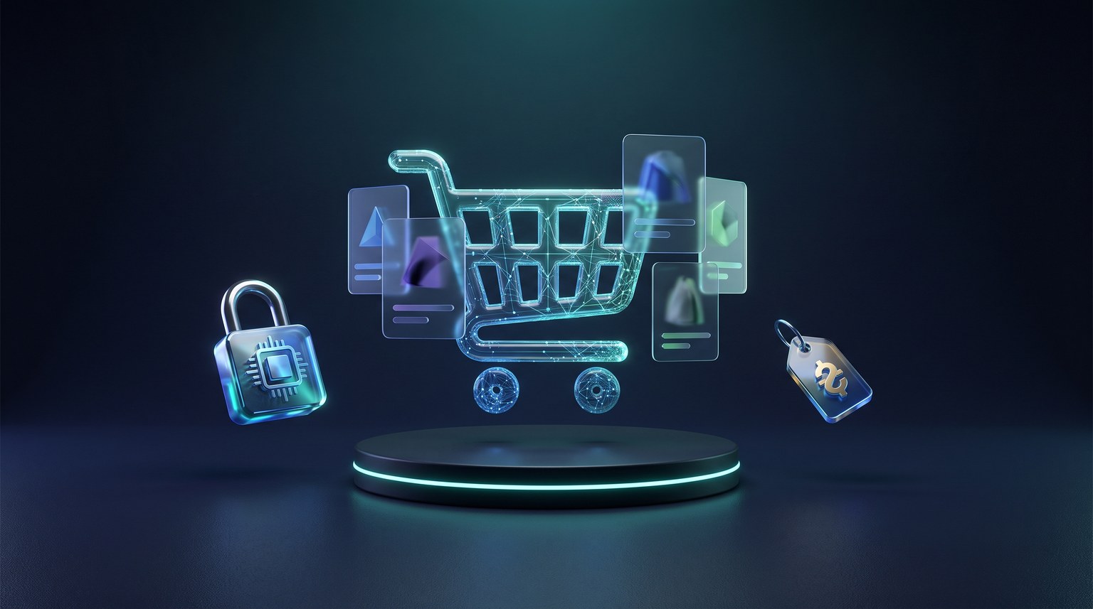
No client on display — sixteen sectors, one method.

This page doesn't show off: it explains. How NEXUS AGENCE designs the storefront of a restaurant, a garage, a clinic, a coffee boutique, a hair salon, a gym, a renovation crew, a landscaper, a funeral home, an excavator, an accountant, a notary, a plumber, a cleaner, a veterinary clinic or a mover — with generic interface mockups built at the agency, sector by sector. No company name, no screenshot of a delivered site, no waiting-list promises: the design approach, the typical content of a mockup, the checks it must pass. And the complete proof isn't displayed — it gets built for your project: a mockup within 48 business hours, by the same studio.

Mockup within 48 business hours · 50% at order, 50% at deployment · EN/FR

Generic mockupsStudio style exercises, by sector — no real client's mockup is displayed anywhere.
Bilingual FR / ENEvery page ships with its English mirror: same structure, same checks, two audiences.
Phone firstThe mockup is calibrated for mobile — that's where your customers decide, at night.
Measured, not decoratedLoad time, readability, buttons: the mockup passes its checks before approval.

The sector approach

Sixteen trades, sixteen ways of deciding.

A storefront is not designed "in general": it is designed for the way a sector buys. A restaurateur sells a craving decided within a minute; a body-shop owner sells reassurance after an accident; a clinic sells an appointment; a coffee boutique sells a daily ritual; a salon sells a certain mood walking in; a gym sells a stronger version of you; a builder sells a project with no surprises; a landscaper sells a Saturday afternoon in front of your house; a funeral home sells remembrance; an excavator sells the scale of the job; an accountant sells rigour; a notary sells seriousness; a plumber sells the emergency; a cleaner sells the shine; a vet sells affection; a mover sells the date. The sixteen interfaces below are generic mockups made at the agency — one style exercise per sector, with the design reasoning printed beside each. No logo, no name, no screenshot of a delivered site: the point is to show how we reason, not to line up clients.

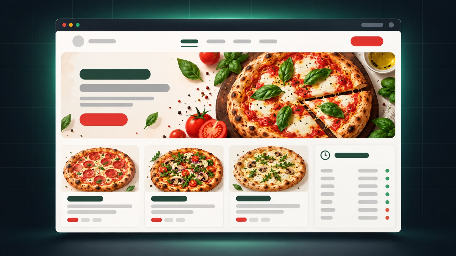
Generic interface mockup for a restaurant or pizzeria: stylized browser window, large lead photo, dish grid with placeholder blocks, hours panel with rhythm tabs
Sector 01motive: appetite

Restaurant, pizzeria — hunger decides fast.

Most visitors to a restaurant arrive hungry — or are planning their next appetite. They don't want to read: they want to see the dish, check the opening hours, and place the call with one thumb. So the mockup puts a full-width lead photo up top, a menu in short cards, opening hours reachable without scrolling, and a call button wherever the thumb lands.

The rest comes down to one rule: nothing delays the first bite of information. No majestic carousel, no parallax — the storefront tells what comes out of the kitchen, three screens at most.

menudish of the dayvisible hourstap-to-call
See the 3D look ↓
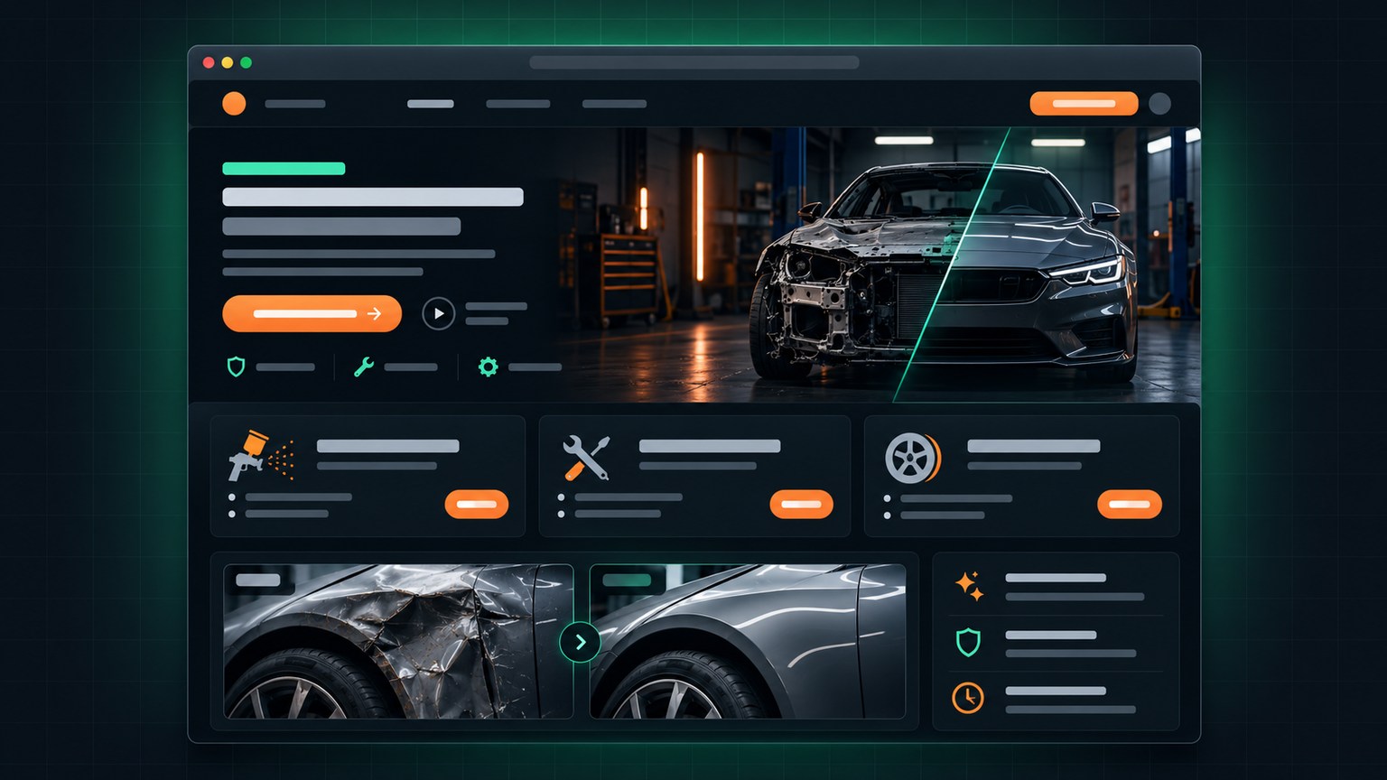
Generic interface mockup for a garage or body shop: dark window, services banner, card grid with orange buttons, before-after images as placeholders
Sector 02motive: reassurance

Garage, body shop — the quote reassures.

Garage customers rarely arrive in a good mood: the car won't start, the windshield just gave up. The mockup therefore opens with what calms: the service list in a legible, predictable grid; before/after pictures that prove the work; and a simple quote request — vehicle type, a phone number, a time to call back.

The intended effect: a person in a panic finds, within thirty seconds, the sense of being taken seriously, a price discussed openly, and an address with directions. The storefront works the night shift while the garage sleeps.

services gridbefore / afterquotedirections
See the 3D look ↓
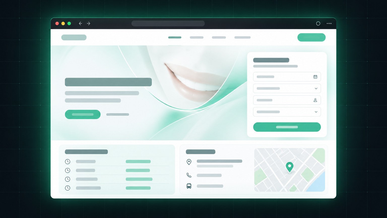
Generic interface mockup for a dental clinic: bright window, soft welcome panel, short booking form, listed hours and a small map block with a fictional address
Sector 03motive: calm

Dental clinic — the appointment comes first.

A clinic's patient wants two things: to book without dialing a number, and to be reassured before arriving. The mockup therefore gives online booking the dominant spot — a short form with no detour fields — then the hours, the address with directions, and a comforting tone across the texts. The rest of the page explains the treatments without medical jargon, section by section.

On mobile, the form becomes the main screen: fields open under the thumb, and the confirmation loops back to the clinic's email. No waiting room has ever lost a patient over one field too many.

bookingdirectionsreassuring tone
See the 3D look ↓
Generic interface mockup for a coffee boutique: warm window, atmosphere carousel, product card grid with price dots, hours strip and a pickup-order button
Sector 04motive: ritual

Boutique, café — atmosphere sells.

A coffee boutique sells a ritual: the morning cup, the Thursday square, the conversation of the place. The mockup therefore leans on large photos that smell of hot coffee, a product grid in short cards with prices stated plainly, exact hours within reach of the screen, and a pickup button for the noon line.

The reasoning holds for any neighbourhood storefront: the picture creates the craving, the grid turns it into a decision, the hours convert it into a visit. A storefront that smells of a warm cup outsells a catalogue.

atmosphere photosproductsexact hourspickup
See the 3D look ↓
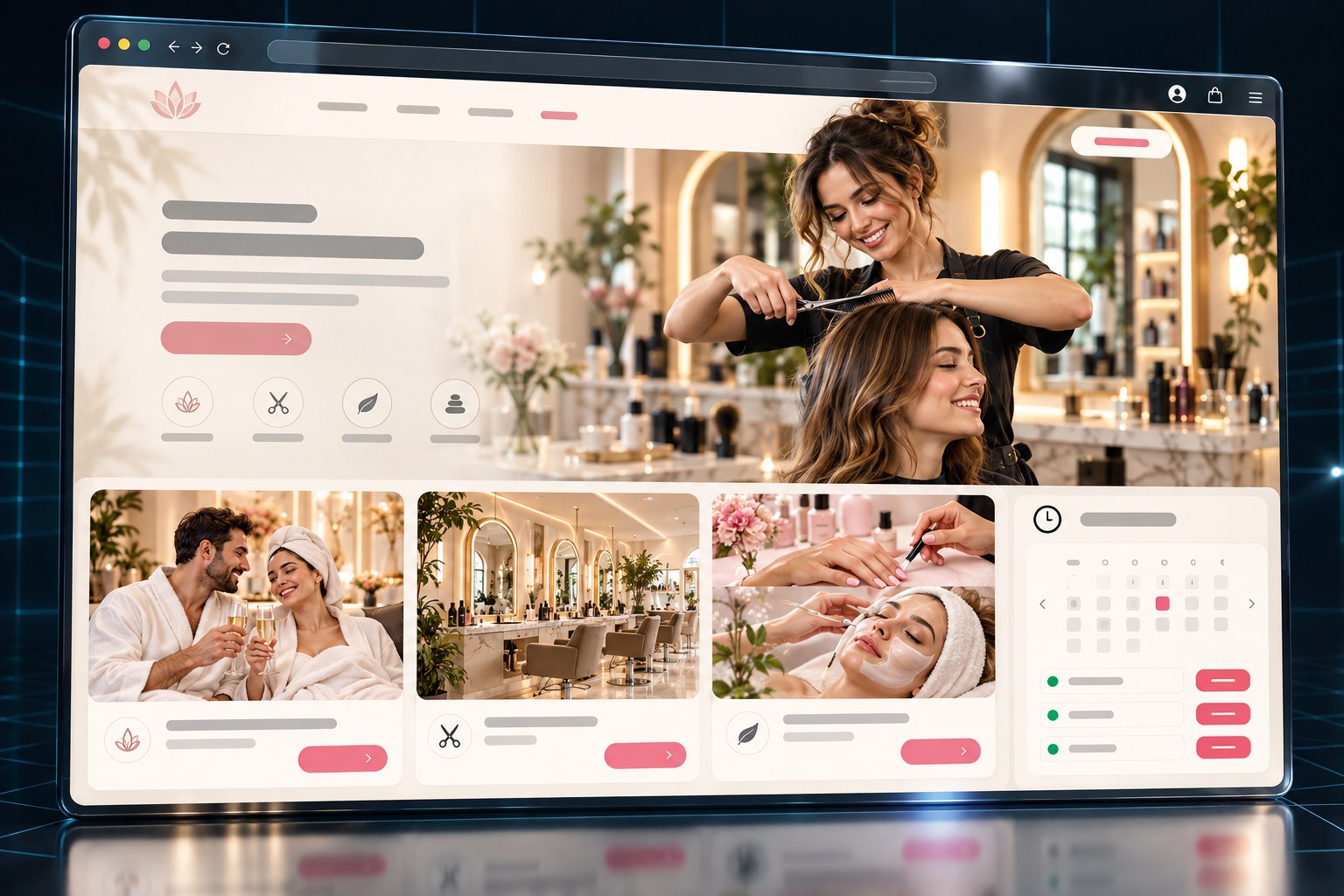
Generic interface mockup for a hair salon and spa: bright window, stylist photo at work, booking cards and hours strip
Sector 05motive: mood

Salon, aesthetics — people book by image.

A salon client chooses with the eyes first: the style that fits them, the place where they feel at home. The mockup therefore opens with a photo full of light — a hand in the hair, not a catalogue pose — then the service grid with prices stated plainly, and online booking never more than a screen away from the top.

The detail that sells: the before/after gallery fed by the salon itself. Every new client photo becomes a standing proof while the salon keeps cutting.

before/after galleryservices & pricesbookingbright photos
See the 3D look ↓
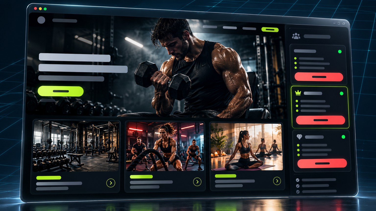
Generic interface mockup for a gym or training studio: dark window, athlete under effort, class cards, team schedule and featured membership
Sector 06motive: energy

Gym, fitness — energy sells in pixels.

A gym doesn't sell machines: it sells the person you become by using them. The mockup allows itself what other sectors do not: deep dark tones, a full-page effort photo, high contrast — because the gym client wants to feel awake, not soothed.

Conversion lives in three blocks: the class schedule in a clear grid, a visible free-trial button placed everywhere, and memberships with prices stated plainly — no fine-print ambush.

free trialclass schedulemembershipseffort photo
See the 3D look ↓

Generic interface mockup for a construction and renovation firm: solid window, site photo with safety vests, before-after project cards and quote strip
Sector 07motive: proof

Construction, reno — the site speaks.

Contractor clients have heard every promise on earth. What reassures them is not a slogan: it's material proof — site photos, the licence displayed, dated before/after shots, service areas, and a clear quote that answers within 24 h.

The mockup builds trust like a foundation: one layer of proof per screen — photos, typical projects, guarantees, direct contact. Nothing floating, nothing abstract: solid, aligned stuff.

licence showndated before/after24 h quoteservice area
See the 3D look ↓
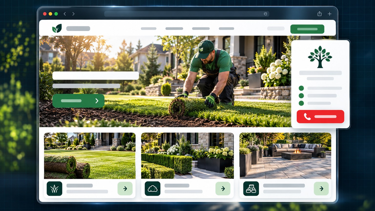
Generic interface mockup for a landscaper: bright window, freshly laid sod photo, seasonal service cards and estimate request
Sector 08motive: season

Landscaper — the season presses.

The landscaper's client has a three-month window and a lawn that judges. The mockup opens on the result — freshly laid sod, hedges trimmed to the string line — then services by season (sod, hedges, grading, interlock), the service area behind, and an estimate request in three fields.

The sector's trap: a catalogue of pretty photos with no address and no season. This mockup isn't that: every photo is localized, every service carries its time window, and the estimate button follows the client from phone to backyard.

seasonal serviceslocalized photos3-field estimatetime windows
See the 3D look ↓
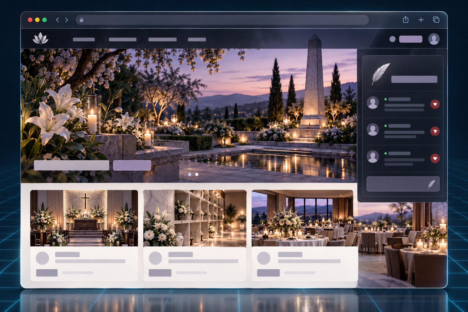
Generic interface mockup for a funeral home: a calming window, candles and lilies, ceremony cards, the obituary and directions
Sector 09decision: the memory

Funeral home — the notice carries the picture.

The family arrives off two days of obituary notices. The mockup opens on the visitation-rooms gallery and the death notice front and centre — readable on a phone from the passenger seat.

Dignity, not urgency: the memorial donation takes one tap, the pre-planning form stays discreet, and the directions to the chapel print large.

death notices pre-planning directions memorial gifts
See the 3D look ↓
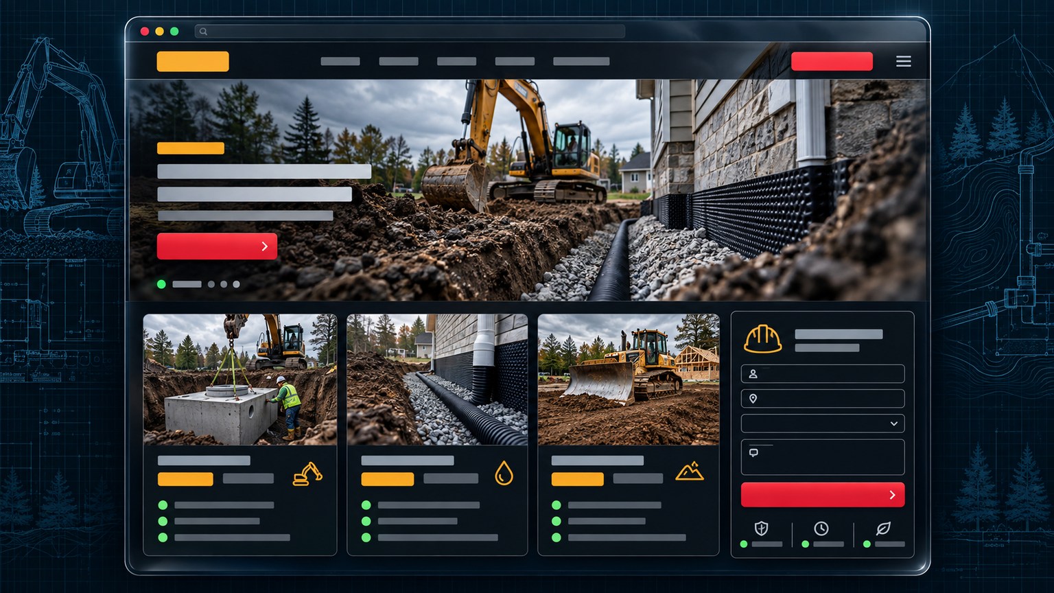
Generic interface mockup for an excavation and drainage company: a resolute window, an excavator at work, service cards and an estimate request
Sector 10decision: the scale

Excavation, drainage — the machine reassures.

The excavation client looks at the machine photo BEFORE the copy: the mockup opens on the excavator at work and the service perimeter.

Every service carries its range: septic systems, French drains, light demolition. Quotes in 48 hours, permits explained in plain words.

septic system french drain permit & 48 h service area
See the 3D look ↓
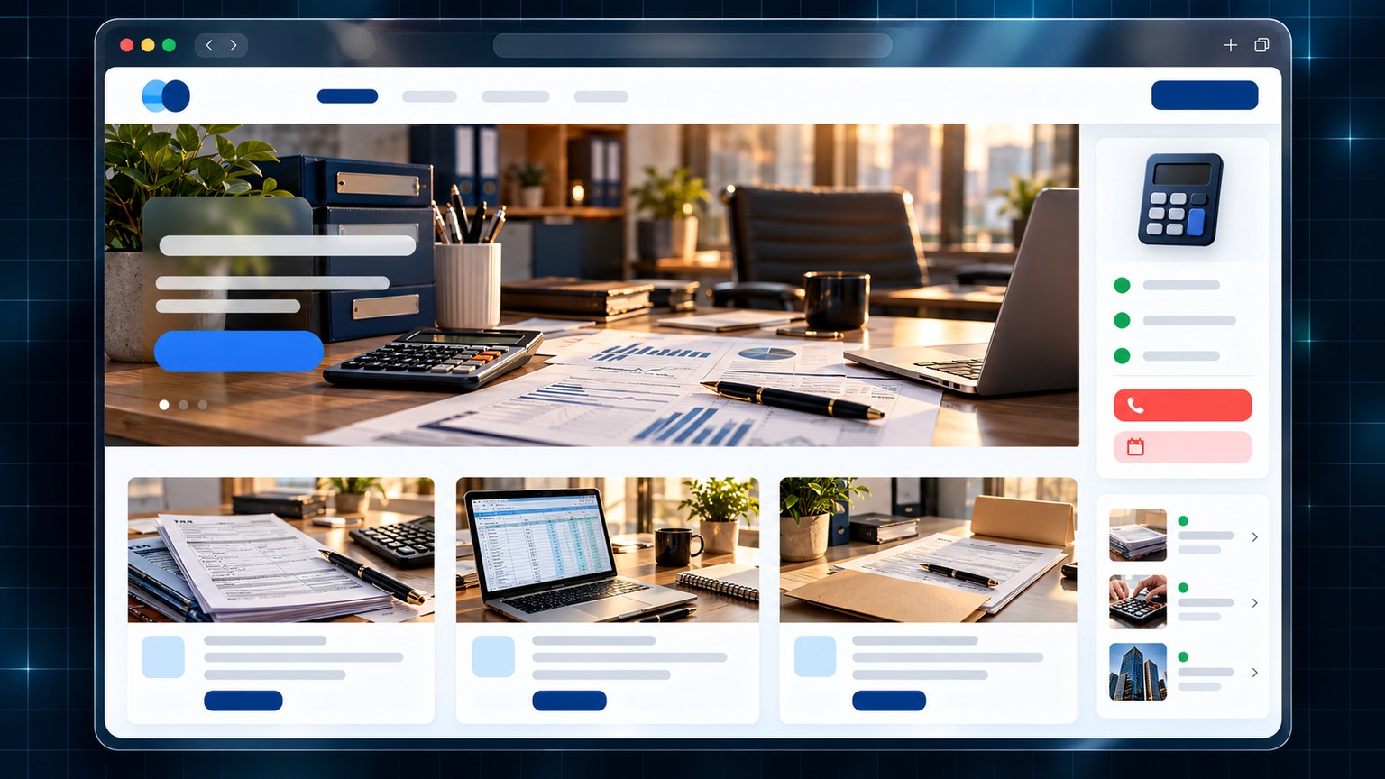
Generic interface mockup for an accounting firm: a tidy window, a warm-lit desk, tax-service cards and appointments
Sector 11decision: the rigour

Accounting firm — rigour reassures.

The mockup installs calm within a second: the advisor, the team with faces, the promise that deadlines never get missed.

Services with posted prices, the client portal behind one button, and a tax FAQ that answers before the question is asked. Tax season calls on its own.

posted prices client portal tax FAQ appointments
See the 3D look ↓
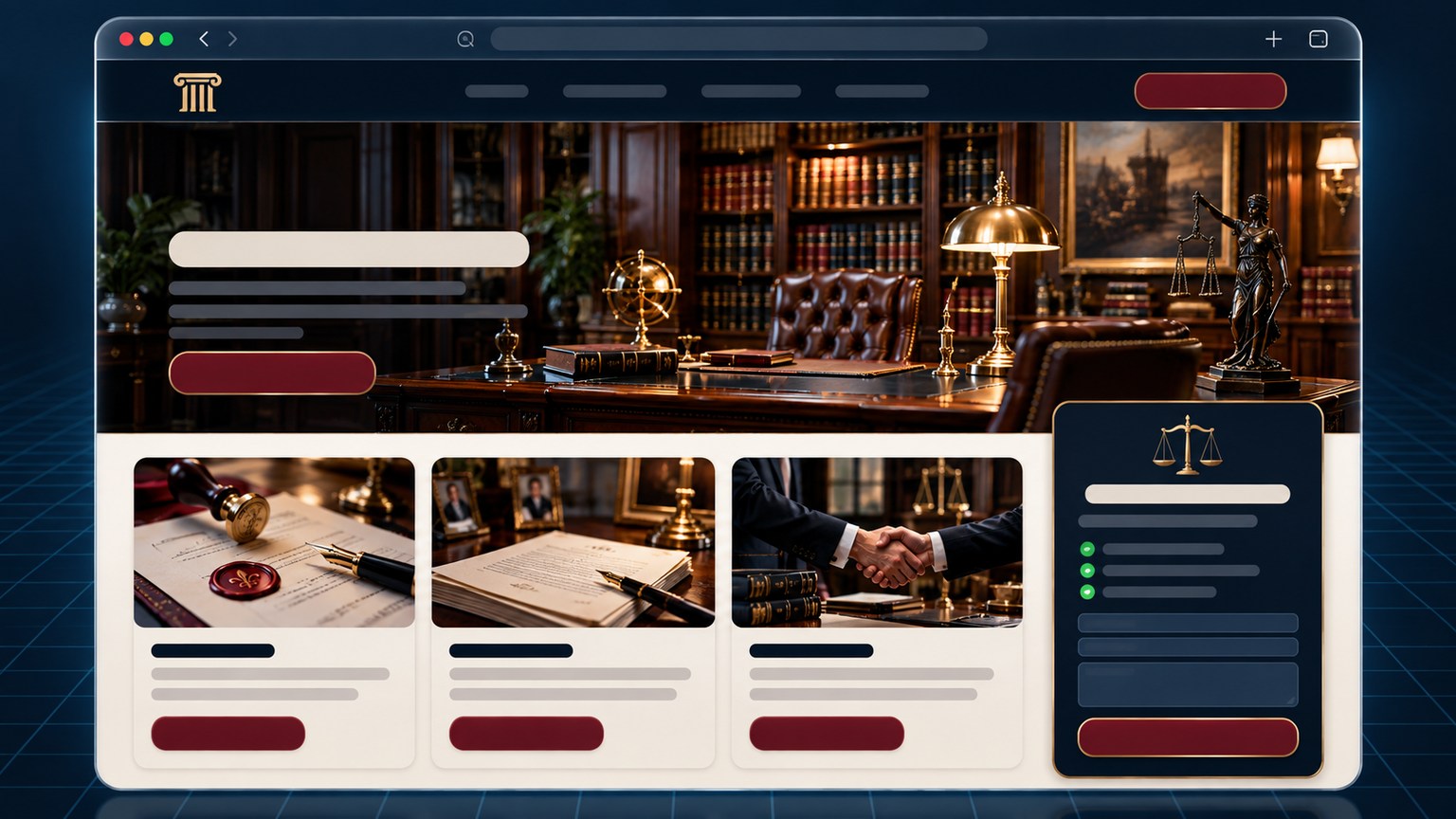
Generic interface mockup for a notary office: a soft-lit window, a law library, legal-service cards and appointments
Sector 12decision: the seriousness

Notary office — the detail distinguishes.

A quiet library, a team with faces and titles: the mockup looks like what the client visits before signing anything.

Wills, estates, property closings: every service lists its steps and fees. Booking an appointment states the fee — no surprise.

wills closings estates clear fees
See the 3D look ↓
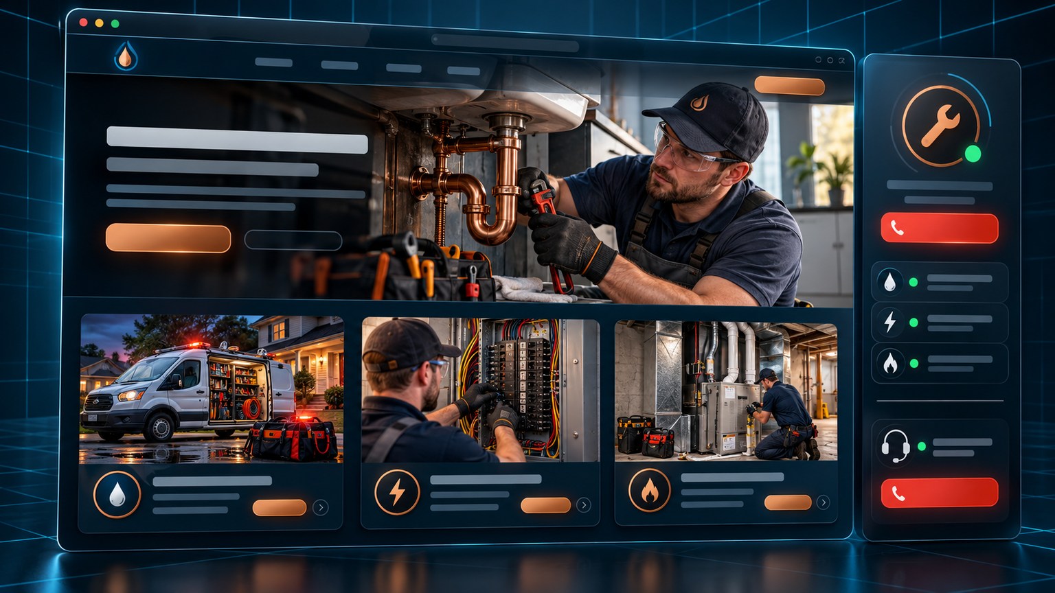
Generic interface mockup for a plumbing and electrical service: a crisp window, a real intervention photo, 24/7 cards and plans
Sector 13decision: the emergency

Plumbing, electrical — the breakdown presses.

The mockup opens on 'flooding right now?' — the 24/7 emergency number in very large type, with under-24-hour service promised.

Annual maintenance plans sit beside it: the same client comes back for the same problem without phoning again. Photos of real call-outs.

24/7 emergency service <24 h maintenance plan real call-outs
See the 3D look ↓
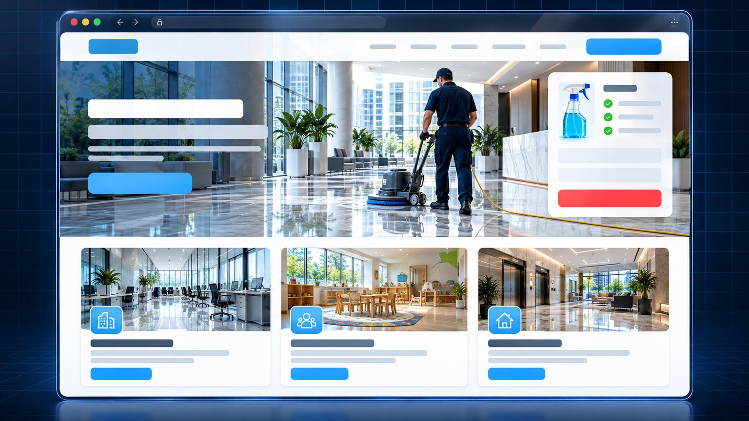
Generic interface mockup for a commercial cleaning company: a sparkling window, a glossy hallway, service cards and a site visit
Sector 14decision: the shine

Cleaning services — the shine proves.

The gleaming-hallway photo sells more than three paragraphs: the mockup puts the BEFORE/AFTER shots first.

Offices, daycares, condo common areas: every tier shows its frequency and price. The estimate visit books in two fields.

before / after offices & daycares free visit screened staff
See the 3D look ↓
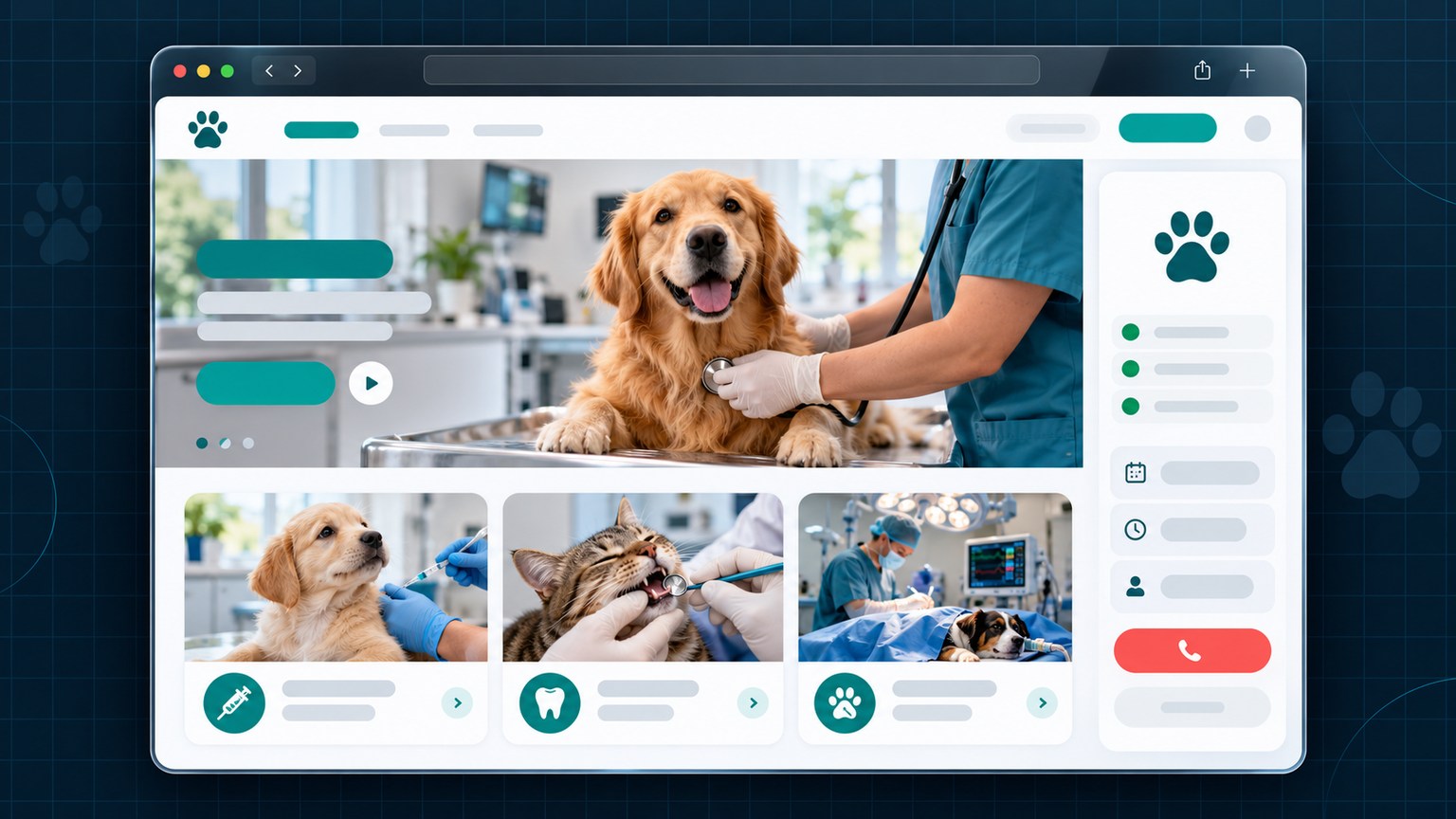
Generic interface mockup for a veterinary clinic: a warm window, a four-legged patient being examined, care cards and practitioner bookings
Sector 15decision: the affection

Veterinary clinic — affection decides.

The four-legged patient's photo at the top, the team that knows every pet's name: the mockup mirrors the clinic.

Vaccines, dental emergencies, surgery: every online appointment slot is up to date with practitioners. The emergency wears its number in a banner.

online booking dental emergency practitioners emergency banner
See the 3D look ↓
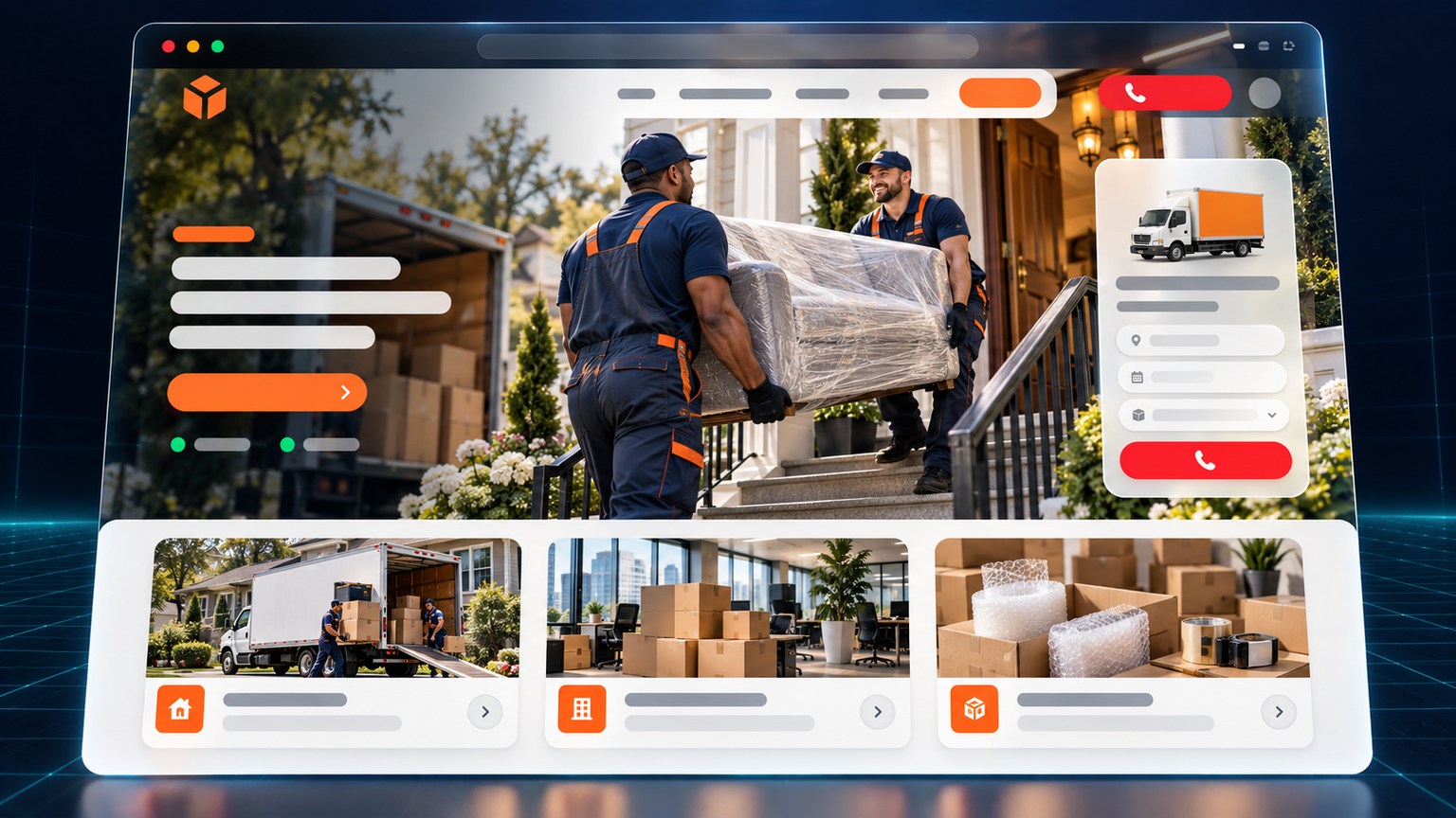
Generic interface mockup for a moving company: a lively window, a loaded truck, service cards, a slot calendar and a quick quote
Sector 16decision: the date

Moving — the date rules.

July 1st arrives in an avalanche: the mockup opens on the slots calendar with the loaded truck.

A four-field quote (volume, floors, distance, date), insurance explained in one sentence, and the packing plan ready to tick.

4-field quote clear insurance july slots packing
See the 3D look ↓

The sixteen interfaces above are generic mockups made at the agency — sector style exercises, with no real business behind them. What a full mockup contains, section by section, reads below; the full sector interfaces are shown on request.

Real 3D presentation

Site looks, presented in 3D.

Each style exercise is presented like a real site in a real window — tilted in space. Hover (or tap) a card: the window straightens toward you, as if you picked it up. The rendering is native CSS 3D: no library loaded, no giant image — the storefront stays light, even here.

Want more details? Click the 3D presentation of an example: its page opens with several demonstrative styles available and all the necessary information.

These windows run on the same system as this site: the 3D position comes from a single transform rule — and it straightens smoothly on hover, on screen or on touch. Each window is a button: click to open the full sector page — description, content and several visuals.

Typical content

What a NEXUS AGENCE mockup contains — before you approve anything.

A mockup, here, is not a glossy image frozen in a PDF: it is a real page, already standing in the agency's system — clickable, readable, ready to translate. Whatever the package, these six ingredients ship by default:

  • Typical sections — the home screen (a clear offer + a button that calls), services as cards, practical info (hours, address, directions), contact (form and/or phone), and a tidy footer.
  • Both languages — FR/EN — the English mirror is structured like the French, end to end, not a rushed translation. This very site demonstrates it: the FR mirror of this page.
  • Mobile first — sizes, targets and content are calibrated on a real phone, because that's where your customers look, held in one palm.
  • The NEXUS AGENCE system — sticky navigation, language switch, restrained on-scroll motion: the storefront's components come from the same skeleton as this site, tested and consistent.
  • Local SEO — title and description set page by page, city and trade named in the text, structured data for the engines — the invisible care that makes the right page surface on Google.
  • Checks already passed — load time, readability, buttons: the mockup arrives verified; the exact list reads at how we measure.

How many sections, and how deep, are then calibrated to your package — the line-by-line detail lives on the services & packages page.

The measurements

How we measure it — three checks, zero poetry.

A "beautiful site" is not a debate: it is verified. Before a mockup reaches you for approval, it passes three real checks — the same ones that keep counting after launch. If one of the three stumbles, the page goes back to the drawing board, and no one makes a fuss about it.

Check 01the stopwatch

Load time.

Everything is local: one stylesheet, processed and light images, no downloaded fonts, no hidden tracking script. The arrival of the first screen is timed — and heavy kilobytes get hunted down before you, on the same hardware a customer would hold in hand.

Check 02the eye

Readability.

Text contrast on a dark background, heading hierarchy, body and target sizes: every page is re-read on a real phone, not in a simulator. If a line demands a magnifier, it goes back — if a button needs begging, so does it.

Check 03the thumb

The CTAs, tested.

Every button points at the real thing: the number dials (tel:), the email opens (mailto:), anchors land exactly where they say, and the form drafts its message. The test runs finger-first, on a real phone — because that's how your customers will click.

The checklistbefore any approval
$ mockup-audit — run on every mockup, EN and FR
✓ 0 external network request on page load
✓ no downloaded font · no CDN · no tracker
✓ title, description and favicon set page by page
✓ hours · address · phone reachable without scrolling
✓ finger test: tel: · mailto: · anchors · main button
✓ EN then FR proofreading — same structure, same sense
→ 6 checks, then the mockup goes to approval.

The same list applies to this site itself: the pages you are reading have passed the six lines — everything is local, one F12 tab and a stopwatch are enough to verify.

Transparency

What this page shows — and what it doesn't.

A portfolio, at the classic agency, is a wall of logos. Here, it is a truth section: exactly what the mockups on this page contain, why clients' sites are not displayed, and how to see further — with no commitment on your side.

The mockups shownstyle exercises

The generic interfaces, in plain words.

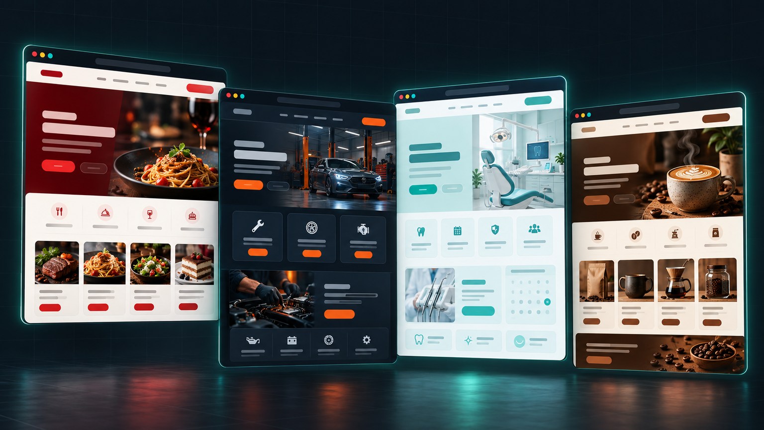
The four sector interfaces are generic mockups made at the agency: style exercises showing an approach — a menu grid, a reassuring quote, appointment booking, a place's atmosphere. They represent no delivered site, no real brand, no company; the visible texts are placeholder bars, on purpose.

Why this choice? Because a site that just went live is not display merchandise. A name posted without consent only binds the one who posts it — and the agency would rather show its method and its checks, which will apply word for word to your storefront.

No company names.

The agency does not publish its clients' sites: no pinned logo, no "our client So-and-So". When a client agrees to tell the project's story, it happens with written consent — and most prefer discretion, just as you would.

No screenshot of a delivered site.

The images displayed here are generic interfaces. Real sites are shown in a private call, to the people concerned, when the clients consent — not on a public window, feeding a comparison parade.

No shelf promises.

Nothing of the "coming soon, stay tuned" kind: the page shows what exists — a method, interfaces, measurements, a deadline that breaks down. What doesn't exist yet doesn't get sold on a storefront.

On requestno engagement

See more: two honest routes.

  • Complete sector mockups — several interfaces per trade — can be shown on request, in a private call, with no form and no engagement: you ask, we share.
  • The demo that counts is your project's: describe your need in the quote form. The mockup of your home page lands within 48 business hours, with no mockup fee — it is included in the package, and the real demonstration is what the agency produces for you.
  • The quote is free and arrives within 24 h — the price and the scope are written in it, before any order.
Official pricesshown only once

$500 — the small site · $1,200 — the service package (Most chosen) · $1,500 — the clinic / advanced package · $59.99 / month — maintenance, cancelable

Payment 50% at order, 50% after deployment · hosting + domain covered the first year by the agency · the line-by-line detail of the packages lives on services.html.

Frequently asked

What people ask about the mockups.

Why don't you show clients' sites?

Professional discretion first: a site that just went live is not display merchandise. Then honesty: a lone screenshot pretends to say everything and says little — the method, the checks, and the mockup of your project say far more. Nothing prevents a private call when a client consents in writing: write in and ask.

Are the four interfaces shown real sites?

No. They are generic mockups made at the agency — one per sector: restaurant-pizzeria, garage-body shop, dental clinic, coffee boutique. No name, no brand, no real address: the texts are placeholder bars, on purpose. They exist to show the design reasoning, not to stand in for a client portfolio.

How can I test the load time of a page here myself?

With no tool installed: open the page, then in your browser (F12), watch the network tab while the page loads — you should see local files only, no request to a third party. The pages weigh a few dozen kilobytes excluding images: weight is what makes time.

Mockup on request — how does it work, exactly?

Two ways. Without engagement: a call or an email — you ask to see the complete sector mockups, and they get shared privately as we chat. The real proof: describe your project in the quote form — reply within 24 h, then the mockup of your home page lands within 48 business hours, with no mockup fee, to approve before the next portion of payment. Slower than four images, infinitely more convincing.

Start

The best demo is already underway: yours.

Describe your project in the quote — free, answered within 24 h — and the mockup of your home page lands within 48 business hours: already measured (load time, readability, CTAs), tested on phone and desktop, to approve before the balance is discussed. The interfaces on this page show the reasoning; the mockup will carry your trade, your colours and your hours.

Free quote · reply within 24 h · quote form · EN/FR

FR